Arranging Wall Art is essential because a thoughtfully designed wall of artwork can transform a room. Art brings color, depth, and personality in a way few other elements can, and unlike bulky furniture, it does not take up valuable floor space. This makes wall art one of the most powerful tools for enhancing interiors, especially in smaller homes or apartments.
Yet while a beautifully styled wall may look effortless once finished, arranging artwork correctly requires planning, visual awareness, and a clear understanding of how individual pieces interact with their surroundings. Where should each piece go? How do you make different artworks work together? How do you avoid a cluttered or unbalanced look?
This guide explains the core principles behind successful wall art arrangements and shows how to curate and hang pieces in a way that feels harmonious, intentional, and visually refined.
Arranging Art: The Core Principles
A strong wall composition is never accidental. Balanced art arrangements tend to share three fundamental qualities:
- Dimensional consistency
- Formal coherence
- Linear structure
These principles apply whether you are hanging a single painting or designing a full gallery wall.
Understanding Scale and Proportion
The first factor to consider is size. Every artwork should be in proportion to the wall and the room around it. A piece that is too large will overwhelm the space and lose its impact, while a piece that is too small will disappear into the background.
Before choosing where a piece will go, step back and study the wall. Think not only about width and height, but also about how the artwork will visually relate to nearby furniture, architectural elements, and lighting. Walls are not isolated surfaces. They are part of a larger composition that includes flooring, windows, textures, and colors.
An artwork should not only fit its wall physically, it should also belong there stylistically. Art is usually added near the end of a design process, which makes it the perfect tool for tying everything together. You can use it to echo shapes, highlight colors, or soften strong lines already present in the room. A curved frame might reflect the shape of a rounded chair. A muted palette might pick up tones from the floor or upholstery. These subtle relationships are what create visual harmony.
Height and Visual Flow
Once size and style are considered, height becomes critical. Artwork that is hung too high or too low breaks the natural visual rhythm of a room. Pieces should feel easy to look at, not like they are floating above or sinking below your line of sight.
A widely accepted guideline is to position the center of the artwork at average eye level, which is roughly 160 cm (about 60 inches) from the floor. This creates a natural visual axis that works for most people and most rooms.
You can imagine an invisible horizontal line running through the space at eye level. Aligning artwork along this line helps maintain consistency and prevents the wall from feeling chaotic.
This rule can shift slightly depending on the context. Art placed above furniture, for example, may need to sit higher, while a gallery wall with multiple pieces may require a shared center point rather than a fixed height for each individual frame. The goal is not strict measurement, but visual balance.
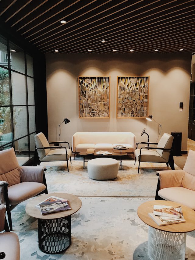
Mixing and Matching Artwork in a Gallery Wall
Hanging a single painting is relatively simple. Creating a wall with multiple artworks is where design becomes more complex. A successful gallery wall always starts with a unifying concept. Without one, even beautiful pieces can feel disconnected.
There are three main ways to create cohesion in a multi-piece arrangement:
- Theme or style
- Medium or type
- Color palette
Theme or Style
Choosing a clear theme provides a strong foundation. This might mean focusing on landscapes, geometric compositions, expressive brushwork, or minimalist abstraction. Whatever direction you choose, consistency is what makes the arrangement feel intentional rather than random.
Mixing highly figurative works with abstract pieces in the same grouping often creates visual tension instead of a clean contrast. While deliberate juxtapositions can work in more advanced interiors, most homes look better when the wall follows one dominant visual language.
If you gravitate toward modern, expressive compositions, abstract art is especially effective for gallery walls because the pieces relate through shape, rhythm, and movement rather than subject matter. The result can feel energetic without becoming visually loud. On tryartwork.com, you can see how curated abstract collections are built to look cohesive together; for more context on the approach behind that curation, visit About TryArtwork.
Medium or Type
When Arranging Wall Art, another powerful way to create unity is by grouping similar types of artwork. A wall made entirely of canvas paintings or framed photography will always look more intentional than one that mixes posters, prints, and paintings randomly.
Different materials reflect light differently and carry different visual weight. When mixed without a clear reason, they can compete rather than complement each other. By sticking to a single medium, you allow the eye to focus on composition and content instead of being distracted by material contrast.
Color as a Unifying Element
Color is often the easiest way to create a cohesive arrangement. Artworks do not need to be identical in tone, but they should speak the same visual language. Even a subtle shared hue can connect very different pieces.
A gallery built around a dominant color such as deep green, warm clay, or muted blues can bring life to a neutral wall and anchor the room. Monochrome palettes are another powerful option. Black-and-white compositions, especially in photography or minimal art, create a timeless, structured look that feels both elegant and personal.
The key is continuity. Even small threads of color repetition help the entire arrangement feel intentional.
Creating Balance Across the Wall
Once the theme, medium, and color are aligned, layout becomes the final step. A gallery wall should be treated as one large artwork made of many parts. Before placing anything on the wall, lay all pieces on the floor or map them out on paper. This allows you to adjust spacing and alignment without committing to nail holes.
Pay attention to:
- Equal visual weight on both sides
- Consistent spacing between frames
- A clear center point for the entire composition
This planning stage is where good arrangements become great ones.
Final Thoughts Arranging Wall Art
Arranging wall art is not about rigid rules, but about understanding how pieces relate to each other and to the space around them. When size, height, color, and style are considered together, even a simple collection of artworks can create a striking, cohesive result.
A well-designed wall does more than decorate a room. It gives it identity, rhythm, and emotional depth. When art is chosen and arranged with intention, the entire space feels more complete.