
It can often be difficult to get a guest room right. On the one hand, you want to add your own personality and style to the space. On the other hand, you need to keep it relatively neutral so anyone, from elderly grandparents to young nieces and nephews, can stay in there.
You’ve also got to think about where in the house it is. For example, a downstairs guest room may lend itself more to wooden or porcelain tile flooring in keeping with the rest of the downstairs, whereas upstairs, the home may be fully carpeted. Therefore the rest of the decor needs to be in keeping with that, including the color scheme.
The color scheme is one of the most important factors in any guest room. It can be the difference between a guest feeling comfortable in it and getting a good night’s sleep and the opposite.
So, what exactly are the best colors to use in a guest room? Here are our top five…
Soft White
Soft white is a classic choice and is a perfect backdrop for styling a guest room. It provides a clean and airy backdrop that can promote a real sense of relaxation and tranquility.
The timeless hue can offer simplicity and serenity that won’t throw guests off. It will maximize natural light and an improved sense of space. Pair it with crisp white bedding, curtains, and furnishings, and you’ve got a harmonious look that exudes sophistication.
Warm Beige
Another popular choice for guest rooms, warm beige is versatile and inviting and can complement various other colors thanks to its earthy hue and sense of warmth. Colors like taupe, camel, and sand can offer an understated elegance while it also suits a variety of textures, including velvet, suede, and faux fur.
Other neutral tones like chocolate, camel and espresso can add further depth and a really cosy feel to a room.
Subtle Grey
Offering a touch of sophistication, greys may not be hugely popular, but they add modernity and refinement to a space. The understated hue is ideal for creating a sense of calm and serenity while also promoting rest and rejuvenation. Silvers, charcoals, and slates are excellent complementary colors that are perfect in cushions, throws, and rugs, creating an incredibly tranquil environment.
Warm Taupe
A dusky, warm taupe is such a welcoming color palette that offers a sense of warmth and homeliness, which is exactly what you want from a guest room. Guests will instantly relax and feel snug in the space.
A perfect tone for the walls, it can be combined with soft furnishings in complementary tones like mocha, caramel, and chestnut for a room that’ll offer real rustic charm.
Soothing Cream
Finally, soothing creams will create a sense of peace and elegance, as well as provide a neutral backdrop that suits any type of flooring and a wealth of colors and textures.
It’ll provide a retreat-like vibe, with tones such as ivory, linen, and pearl perfect for soft furnishings, while you may also want to add soft colors like warm taupe into cushions, throws, and rugs to add a little more color.
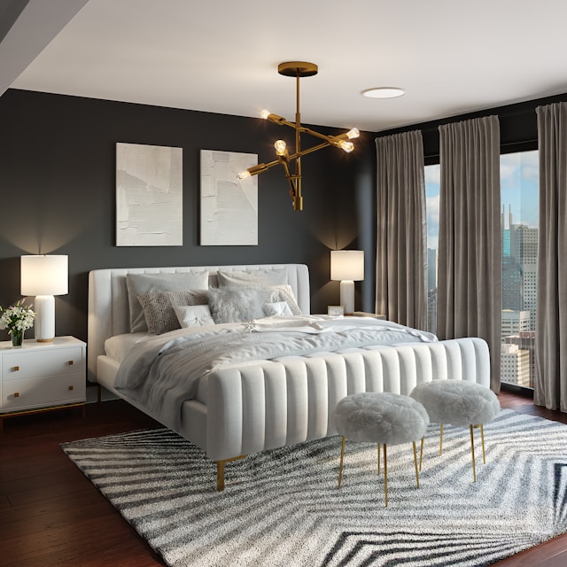
Featured Photo by Spacejoy on Unsplash